
In my previous post, I imported and merged three real-world datasets in R. After preparing the data, I was ready to take the next step. In this post, I ran my first regression model to explore the relationship between life expectancy, public health expenditure, and GDP per capita.
Preparing the Variables
Before running the regression, I simplified the variable names because the original column names were very long and difficult to use.
names(final_data)[4] <- “life_exp”
names(final_data)[5] <- “health_exp”
names(final_data)[6] <- “gdp_pc”
After renaming the variables, it became easier to work with the dataset.
Running the Regression
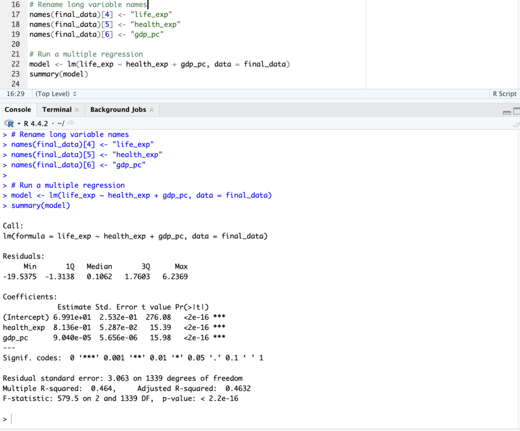
After preparing the variables, I ran a simple regression model to examine how health expenditure and GDP per capita are related to life expectancy.
model <- lm(life_exp ~ health_exp + gdp_pc, data = final_data)
summary(model)
This model helps me understand that countries with higher healthcare spending and higher income levels tend to have higher life expectancy. However, this model only shows a relationship and does not prove causation. There may be other factors that also affect life expectancy.
Visualizing the Relationship
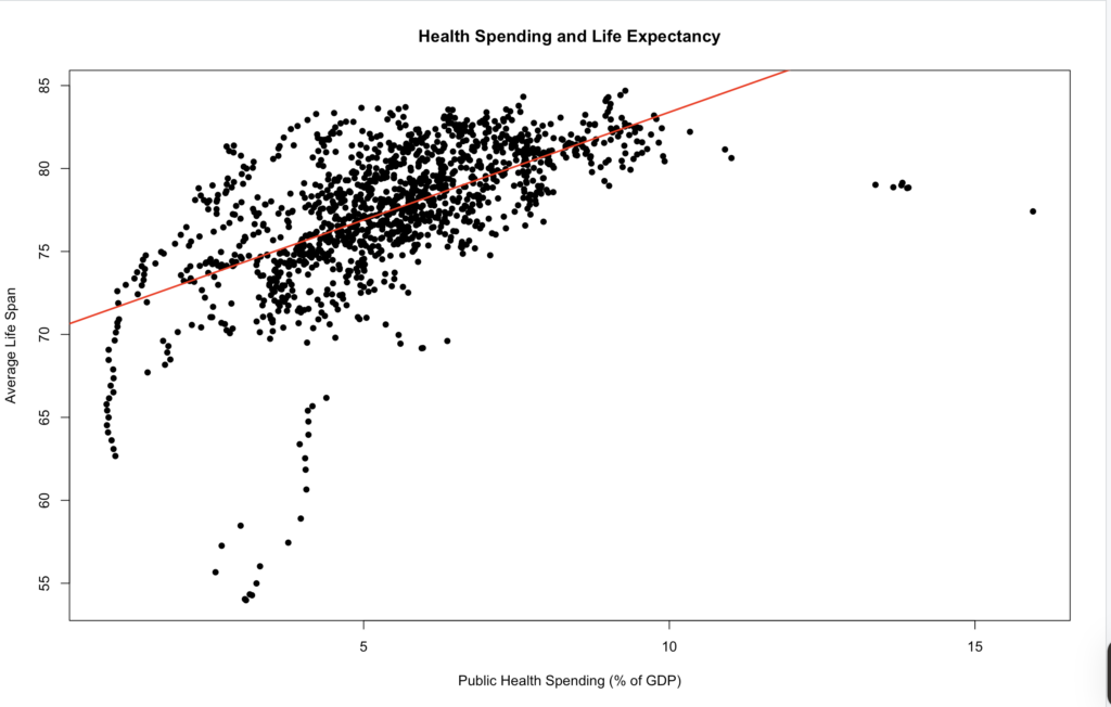
To better understand the results, I created a scatter plot with a regression line.
plot(final_data$health_exp, final_data$life_exp,
xlab = “Public Health Spending (% of GDP)”,
ylab = “Average Life Span”,
main = “Health Spending and Life Expectancy”,
col = “black”,
pch = 16)
abline(lm(life_exp ~ health_exp, data = final_data),
col = “red”, lwd = 2)
The plot shows a clear positive relationship between public health spending and life expectancy. In general, countries that spend more on healthcare tend to have longer life expectancy.
In this post, I used real-world data to run a regression model and visualize the relationship between health spending and life expectancy. This helped me better understand how data analysis works in practice.